Finding the right colors can make you look radiant and confident, while the wrong ones leave you looking washed out or tired. Color analysis secrets help anyone discover which shades enhance their natural beauty and make shopping decisions easier.
This guide is perfect for people who struggle with choosing flattering colors, feel overwhelmed by their wardrobe choices, or want to look their best without the guesswork. You’ll learn how to identify your natural color profile and discover which seasonal color system matches your skin tone, hair, and eyes.
We’ll walk you through simple at-home testing methods you can try right now, plus show you how understanding your colors transforms both your wardrobe and makeup routine. By the end, you’ll have the confidence to choose colors that make you glow every single day.
Understanding Your Natural Color Profile
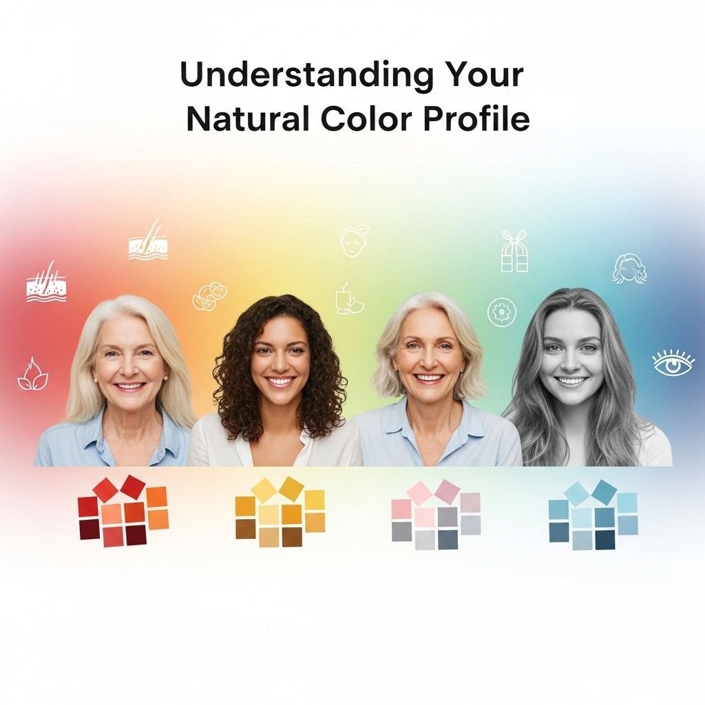
Identify Your Skin’s Undertones and Overtones
Your skin’s undertone acts as the foundation for your entire color profile. Unlike your surface skin color (overtone), which can change with sun exposure or makeup, your undertone remains constant throughout your life. The three main undertone categories are warm (yellow, golden, or peachy), cool (pink, red, or blue), and neutral (a balanced mix of warm and cool).
To identify your undertone, examine the veins on your wrist under natural light. Blue or purple veins typically indicate cool undertones, while green or olive-tinted veins suggest warm undertones. If you can’t clearly distinguish the color, you likely have neutral undertones. Another reliable method involves holding white and cream fabrics near your face—white will look better on cool undertones, while cream flatters warm undertones.
Your overtone encompasses the surface color variations like freckles, rosacea, or tan lines. These elements create complexity in your coloring but don’t change your underlying undertone classification. Understanding both layers helps you select colors that harmonize with your natural palette rather than competing against it.
Determine Your Eye Color Variations and Patterns
Eye color analysis goes far beyond basic categories like “brown” or “blue.” Your eyes contain multiple color variations, flecks, and patterns that contribute to your overall color harmony. Brown eyes might contain golden, amber, or reddish undertones. Blue eyes can range from steel gray-blue to bright aqua, often with yellow or gray flecks around the pupil.
Green eyes typically show the most variation, displaying combinations of yellow, brown, gray, or blue undertones. Hazel eyes change appearance based on lighting and surrounding colors, revealing their complex blend of green, brown, and gold tones. The key lies in identifying the dominant and secondary colors within your iris.
Pay attention to the limbal ring—the dark circle around your iris—and any radiating patterns or color variations from the pupil outward. These details influence which colors will make your eyes appear brighter and more vibrant versus those that might wash them out or create unflattering contrast.
Analyze Your Natural Hair Color Depth and Warmth
Natural hair color provides crucial information about your color depth and temperature preferences. Hair color depth ranges from very light (platinum blonde) to very dark (black), while warmth refers to the underlying red, gold, or ash tones present in your hair.
Even within similar depth levels, hair can lean warm or cool. For example, two people with medium brown hair might have completely different undertones—one with golden highlights indicating warmth, another with ash tones suggesting coolness. Gray hair often reveals underlying tones as well, appearing either silvery-cool or having golden or yellowish casts.
Consider your hair’s behavior in different lighting conditions. Does it appear reddish in sunlight? Do you see golden highlights, or does it look flat and ash-colored? Your natural hair color typically harmonizes with your skin undertones, providing valuable clues about your ideal color palette.
Recognize How These Elements Work Together
Your skin, eyes, and hair work as a cohesive color system, each element influencing how others appear. When these elements share similar undertones—all warm or all cool—you likely have a clear seasonal color type. However, many people display mixed characteristics, requiring more nuanced color selections.
The contrast level between these features also matters significantly. High contrast occurs when you have dark hair with light skin or very light hair with dark skin. Low contrast means your features are similar in depth, creating a softer overall appearance. Medium contrast falls between these extremes.
Your natural color harmony determines which colors will look effortless and flattering versus those requiring extra makeup or styling to work. Colors that echo your natural undertones and complement your contrast level will make you look healthy, vibrant, and polished with minimal effort.
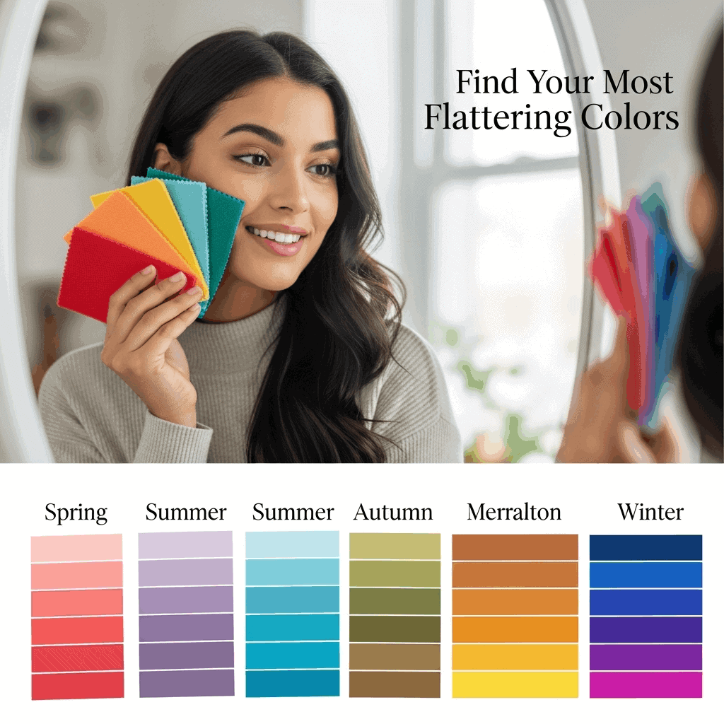
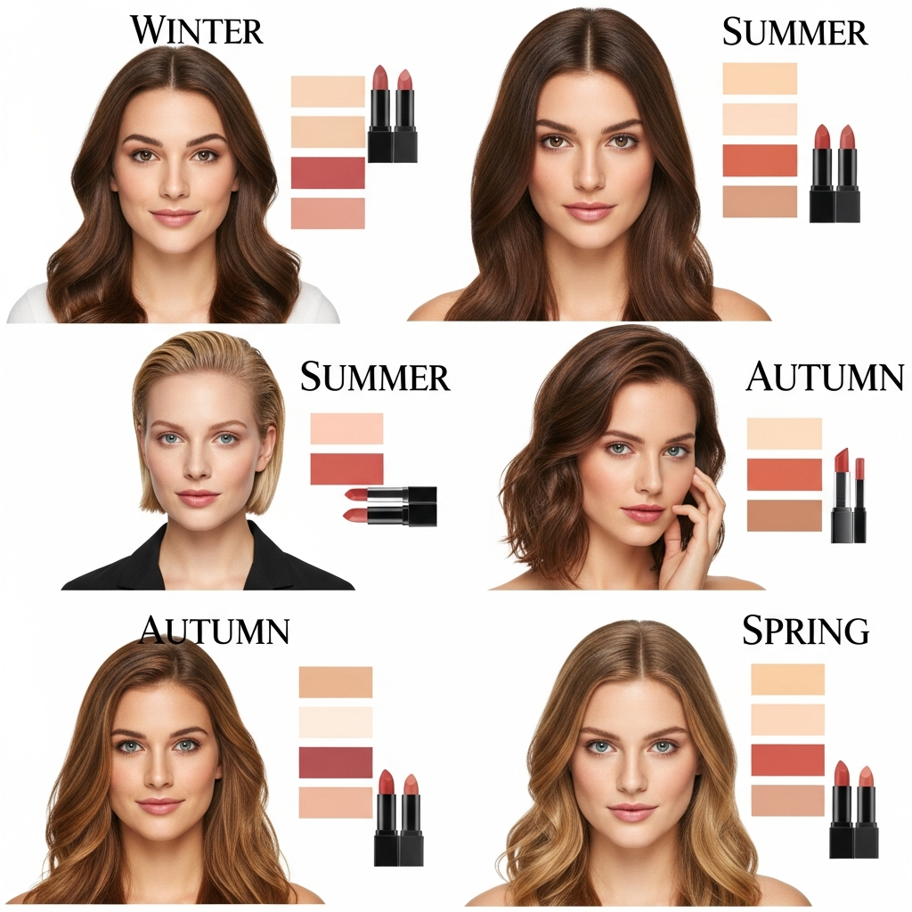
The Four Seasonal Color Systems Explained
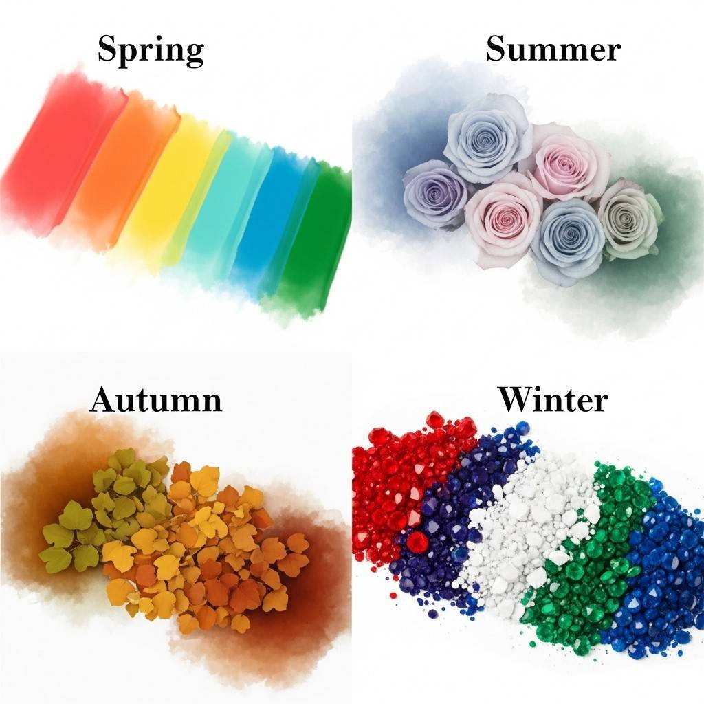
Spring Palette Characteristics and Ideal Candidates
Spring colors burst with energy and clarity, much like the season itself. People who belong to this color family typically have warm undertones with bright, clear coloring. You might be a Spring if you have light to medium skin with golden, peachy, or ivory undertones, blonde to light brown hair with golden highlights, and eyes that are bright blue, green, or light brown with golden flecks.
The Spring palette features colors that are warm-based and saturated – think coral, bright orange, golden yellow, kelly green, and clear turquoise. These colors have a fresh, vibrant quality without being too deep or muted. Classic Spring colors include:
- Warm whites and creams (ivory, warm white)
- Golden yellows (buttercup, golden yellow)
- Coral and peach tones (coral pink, salmon)
- Clear greens (kelly green, bright lime)
- Warm blues (periwinkle, clear aqua)
Spring types should avoid colors that are too dark, muted, or cool-toned, as these can make them appear washed out or tired.
Summer Color Family and Cool Undertones
Summer represents the softer side of cool coloring. If you’re a Summer, you likely have cool undertones in your skin, whether it’s fair with pink undertones, medium with blue-pink undertones, or deeper with cool brown undertones. Hair colors range from ash blonde to medium brown, often with natural ashy or cool highlights, while eyes are typically blue, green, hazel, or soft brown.
Summer colors are muted and cool, creating a sophisticated and elegant appearance. The palette includes soft, dusty versions of colors rather than bright or intense shades:
| Color Category | Summer Examples |
| Blues | Powder blue, periwinkle, navy |
| Pinks | Rose pink, dusty rose, mauve |
| Purples | Lavender, soft plum, lilac |
| Greens | Sage green, seafoam, mint |
| Neutrals | Cool gray, taupe, soft white |
Summers should steer clear of warm, golden-based colors and anything too bright or harsh, which can clash with their naturally soft coloring.
Autumn Warmth and Rich Earth Tones
Autumn people embody warmth and richness in their natural coloring. Your skin likely has golden, warm beige, or bronze undertones, with hair ranging from strawberry blonde to deep auburn or rich brown with golden or red highlights. Eyes are often warm brown, amber, hazel with golden flecks, or deep green.
The Autumn palette draws from nature’s harvest season – deep, warm, and earthy colors that feel grounded and substantial. These colors have a muted quality but maintain their warmth and richness:
- Deep oranges and rusts (burnt orange, terra cotta)
- Golden browns (chocolate brown, camel)
- Warm reds (brick red, burgundy)
- Earth greens (olive, forest green, moss)
- Golden yellows (mustard, amber)
Autumn types should avoid cool-toned colors, anything too bright or icy, and colors that are too light or pastel, as these can make their warm coloring appear muddy.
Winter Contrast and Bold Color Choices
Winter types are characterized by high contrast in their natural coloring and can handle the most dramatic colors. You might be a Winter if you have cool undertones with either very fair skin and dark hair, or deeper skin tones with strong contrast. Hair is typically dark brown to black, sometimes silver or white, while eyes are often dark brown, black, bright blue, or green with clear whites.
The Winter palette consists of clear, bold colors with cool undertones that match the season’s crisp, dramatic quality. These colors are either very light or very dark, with little middle ground:
- True colors (pure white, true red, royal blue)
- Jewel tones (emerald green, sapphire blue, amethyst)
- Bold contrasts (black, bright white, hot pink)
- Cool berries (cranberry, fuchsia, burgundy)
- Icy pastels (icy pink, pale yellow, mint)
Winters should avoid warm-based colors, anything too muted or dusty, and colors that lack clarity or intensity, as these can make their striking natural contrast appear dull.
Simple At-Home Color Testing Methods
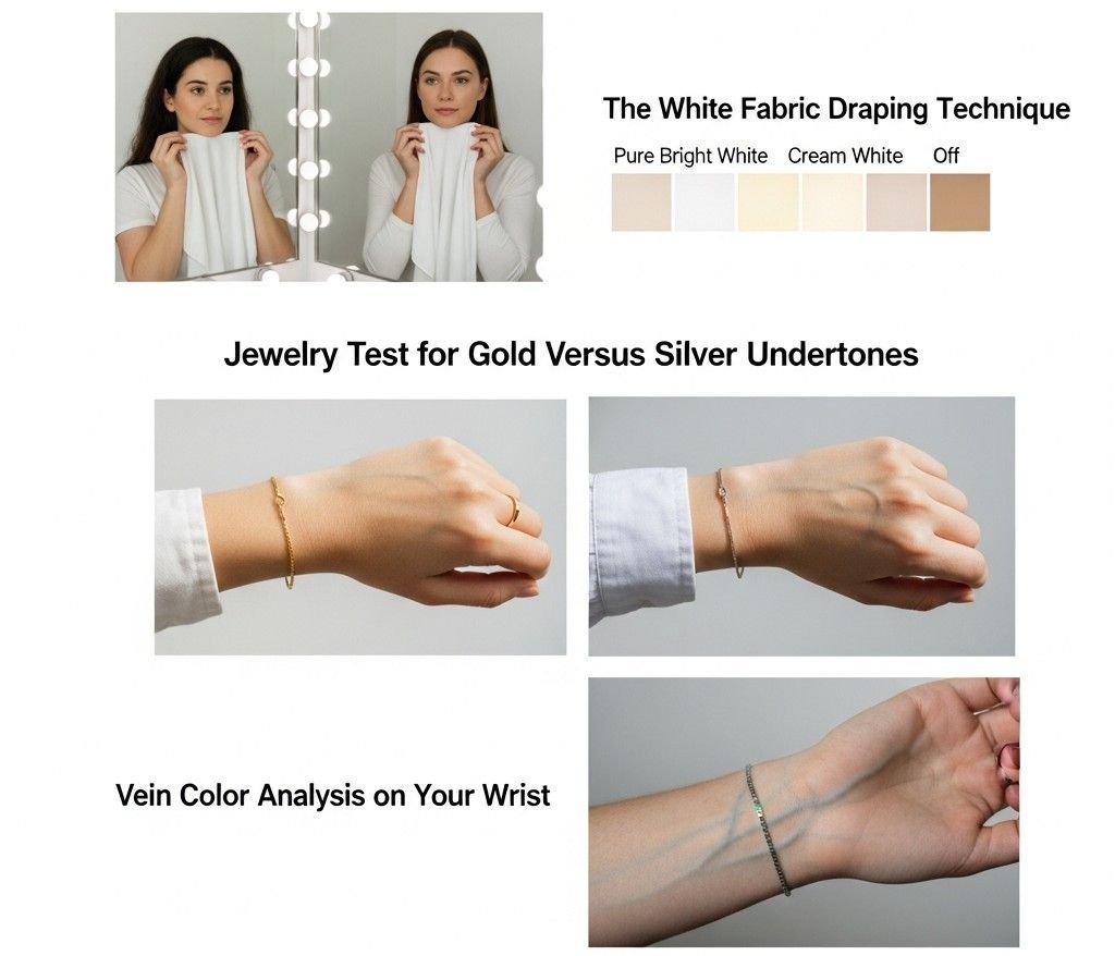
The White Fabric Draping Technique
White fabric draping remains the gold standard for determining your color temperature and intensity preferences. Gather several white fabrics with different undertones: pure bright white, cream white, and off-white. Stand in front of a mirror in natural daylight and hold each fabric under your chin.
Pay attention to how each white affects your complexion. The right white will make your skin look clear, bright, and healthy, while the wrong one creates a washed-out or sallow appearance. Cool undertones typically look best in bright, pure whites, while warm undertones shine in cream or ivory whites.
Take note of how the fabric interacts with any shadows or discoloration around your face. The correct white minimizes dark circles under your eyes and reduces the appearance of blemishes or redness. Your teeth should also appear whiter against the right fabric choice.
Try this test at different times of day to confirm your results, as lighting can significantly impact how colors appear against your skin. Morning light tends to be cooler, while afternoon light leans warmer.
Jewelry Test for Gold Versus Silver Undertones
Your jewelry preferences often reveal your natural undertones before you even realize it. Hold gold and silver pieces against your wrist or near your face in natural light. People with warm undertones typically look radiant in gold jewelry, which complements their yellow or peachy skin base.
Cool undertones usually favor silver, platinum, or white gold, which harmonizes with their pink or blue skin base. The metal that makes your skin look brighter and more vibrant indicates your undertone family.
Don’t rely solely on personal preference here – you might love silver jewelry but actually look better in gold. Focus on which metal makes your skin appear clearer and more luminous rather than which you prefer aesthetically.
Rose gold offers a middle ground and often works well for people with neutral undertones who can wear both warm and cool colors successfully.
Vein Color Analysis on Your Wrist
Examining the veins on the inside of your wrist provides another reliable indicator of your undertones. Look at your veins in natural light – artificial lighting can skew the colors you see.
Blue or purple veins typically indicate cool undertones, suggesting you’ll look best in colors with blue bases. Green veins usually point to warm undertones, meaning yellow-based colors will be most flattering on you.
If your veins appear blue-green or you have difficulty determining the color, you likely have neutral undertones and can wear both warm and cool colors effectively. Some people see different colored veins on the same arm, which also suggests neutral undertones.
Check multiple areas on your wrist and inner arm, as vein color can vary slightly in different locations. The most accurate reading comes from the area where veins are most visible and prominent.
Professional Color Analysis Benefits and Process
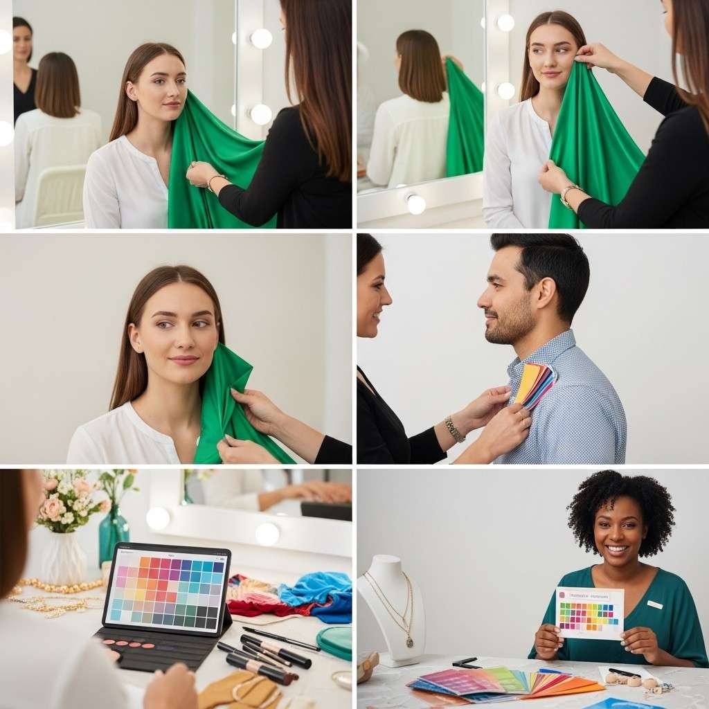
What to expect during a consultation
A professional color analysis session typically lasts 2-3 hours and begins with the analyst examining your natural coloring in optimal lighting conditions. You’ll sit in front of a large mirror while the consultant holds various colored drapes against your face, observing how each hue affects your skin tone, eye brightness, and overall appearance.
The analyst will look for subtle changes – does a particular color make your skin appear clearer or muddy? Do your eyes sparkle or look dull? Are there any shadows or dark circles that appear or disappear? They’ll also assess your natural contrast levels and undertone by examining your hair, skin, and eye colors together.
During the session, you’ll learn about color temperature (warm vs. cool), saturation levels, and value (light vs. dark) as they apply specifically to you. Many consultants photograph you with different colors to help you see the dramatic differences that might be subtle to your untrained eye. You’ll also discuss your lifestyle, profession, and style preferences to ensure your color recommendations work practically with your life.
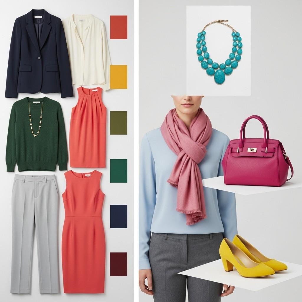
Personalized color palette creation
Your analyst will create a customized palette containing 30-50 colors that harmonize perfectly with your natural coloring. This palette typically includes:
- Foundation colors: Your best neutrals for building outfits
- Accent colors: Bold hues that make you shine
- Metallics: Your most flattering jewelry tones (gold, silver, or both)
- Business colors: Professional shades for work environments
- Evening colors: Sophisticated options for special occasions
The palette comes with fabric swatches or color cards that you can carry while shopping. Many analysts now provide digital versions through apps or PDF files, making it easier to reference your colors anywhere. Your palette will also include guidance on color combinations, showing you which colors work beautifully together and which to avoid mixing.
Some consultants provide seasonal updates, recognizing that your coloring may shift slightly with age, sun exposure, or hair color changes. They’ll also explain how to adapt trending colors to work within your palette.
Investment value and long-term wardrobe savings
Professional color analysis typically costs $200-600, which many clients recover within their first few shopping trips. When you know your exact colors, you make fewer purchasing mistakes and buy pieces that coordinate effortlessly with your existing wardrobe.
The financial benefits compound over time:
| Before Color Analysis | After Color Analysis |
| Frequent shopping mistakes | Confident purchases |
| Clothes that don’t work together | Coordinated wardrobe |
| Need for frequent replacements | Long-lasting pieces |
| Impulse buying based on trends | Strategic, purposeful shopping |
Clients report spending 30-50% less on clothing while looking significantly better. You’ll stop buying items that languish unworn in your closet and instead build a versatile wardrobe where everything works together. The psychological benefits are equally valuable – increased confidence, reduced decision fatigue when getting dressed, and consistent compliments from others.
Finding qualified color analysts in your area
Look for analysts certified through established training programs like Color Me Beautiful, Colour Me Confident, or the International Association of Color Consultants. Many qualified consultants have backgrounds in fashion, interior design, or cosmetology, bringing additional expertise to your session.
Research potential analysts by:
- Reading client testimonials and before/after photos
- Checking their training credentials and years of experience
- Scheduling brief phone consultations to assess their approach
- Asking about their specific methodology and what’s included
Virtual consultations have become increasingly popular and effective, especially for those in areas without local analysts. Online sessions work well because color analysis relies heavily on comparison and contrast, which translate clearly through high-quality video calls.
Many department stores and image consulting firms offer color analysis services. Independent consultants often provide more personalized attention and follow-up support, while larger organizations may have more structured processes and additional services like personal shopping assistance.
Building a Flattering Wardrobe with Your Colors
Essential Pieces in Your Best Shades
Start with the basics that form your wardrobe foundation. Invest in a well-fitted blazer in your most flattering neutral – this could be a warm camel for autumn types or a cool navy for winter personalities. A classic white shirt is non-negotiable, but make sure it’s the right white for you. Cool undertones shine in bright white, while warm undertones look radiant in cream or off-white.
Your go-to dress should be in a color that makes people compliment your skin rather than the outfit. For spring types, this might be a coral sheath dress, while deep winters might choose emerald green. Don’t forget a versatile cardigan or sweater in your signature color – that shade that makes your eyes pop and your complexion glow.
Build your foundation with quality pieces in your best neutrals first. These create endless outfit possibilities and provide the perfect canvas for adding your accent colors later.
Mixing and Matching Within Your Palette
Think of your color palette as a curated paint set where every shade works beautifully together. Cool seasons can confidently pair navy with gray, burgundy with purple, or emerald with sapphire. Warm seasons create stunning combinations with rust and gold, olive green with burnt orange, or chocolate brown with cream.
The magic happens when you understand the temperature and intensity of your colors. Light summers can mix soft lavender with powder blue and rose pink in the same outfit without looking chaotic. Deep autumns can boldly combine forest green, burnt sienna, and gold for a rich, sophisticated look.
Start with one neutral piece and add two colors from your palette. For example, wear your best gray pants with a soft blue blouse and a dusty pink scarf if you’re a summer type. The key is maintaining the same temperature and intensity throughout your outfit.
Strategic Accent Colors for Variety
Even within your ideal palette, certain shades will become your showstoppers – those colors that make strangers stop you on the street to ask where you got that amazing top. These are your accent colors, and they’re pure gold for creating variety without straying from what works.
Accent colors appear in smaller doses through accessories, scarves, jewelry, or statement pieces. A winter type might use bright fuchsia as an accent against their navy and gray basics. Spring types can energize neutral outfits with pops of coral or bright turquoise.
Don’t be afraid to experiment with your brightest or most intense palette colors as accents. That vibrant shade you love but feel nervous wearing head-to-toe becomes perfect for a bold necklace, handbag, or shoes. This strategy keeps your wardrobe feeling fresh while staying within your flattering range.
Shopping Tips to Avoid Costly Mistakes
Always shop with good lighting – those fluorescent department store lights can make any color look terrible. If possible, take items outside or near a window to see the true color. Your phone’s camera can also help you see colors more objectively than your excited shopping brain.
Keep a small swatch of your best colors in your wallet or take a photo of your palette on your phone. When something catches your eye, compare it to your reference. If it doesn’t match the temperature and intensity of your colors, walk away, no matter how much you love the style.
Try the “face test” in the fitting room. Hold the garment up to your face and look in the mirror. Does your skin look clearer and brighter, or does it appear dull and washed out? Your face will tell you immediately if the color works, regardless of whether it’s technically in your palette.
Avoid shopping when you’re feeling bored with your wardrobe or seeking a dramatic change. These emotions often lead to purchasing colors that feel exciting in the moment but end up unworn because they don’t truly flatter you. Stick to your palette and find excitement through new styles and textures in your proven colors instead.
Makeup and Hair Color Coordination
Foundation and Concealer Shade Selection
Finding your perfect foundation starts with understanding your skin’s undertones, which directly connects to your seasonal color palette. Cool-toned individuals typically have pink, red, or blue undertones and should look for foundations with similar cool bases. Warm-toned people have yellow, golden, or peachy undertones and need foundations that match this warmth. Neutral undertones can work with both cool and warm-based foundations.
Test foundation shades along your jawline in natural light, not on your hand or wrist. The right shade should disappear into your skin without creating a visible line. For concealer, choose a shade one tone lighter than your foundation for under-eye coverage, and match your exact foundation shade for blemish coverage.
Those with deep winter palettes often look stunning in foundations with cool, clear undertones, while soft summers need more muted, cool-based shades. Spring personalities shine in warm, golden foundations, and autumn types need rich, warm bases with yellow or golden undertones.
Lipstick and Blush Color Harmony
Your seasonal color palette provides a roadmap for choosing lipsticks and blushes that create natural harmony with your complexion. Cool-toned individuals should gravitate toward berry shades, true reds, roses with blue undertones, and cool pinks. These colors complement their natural coloring without clashing.
Warm-toned people look radiant in coral lipsticks, orange-based reds, peachy pinks, and warm berry shades. The key is ensuring your lip color has the same temperature as your undertones.
For blush selection, cool types should choose rosy pinks, berry tones, and plums, while warm types flourish in peach, coral, and warm pink shades. Apply blush to the apples of your cheeks and blend upward toward your temples for the most flattering effect.
| Color Season | Best Lipstick Shades | Ideal Blush Colors |
| Winter | True red, berry, deep pink | Rose, berry, cool pink |
| Summer | Soft rose, mauve, cool pink | Dusty rose, soft pink |
| Autumn | Coral, warm red, peach | Peach, coral, warm bronze |
| Spring | Coral pink, warm red, peach | Peachy pink, coral, apricot |
Hair Color Choices That Enhance Your Features
Your natural coloring provides clues about which hair colors will make you look vibrant and healthy versus washed out or harsh. Cool-toned individuals typically look best in hair colors with ashy, cool undertones like platinum blonde, ash brown, burgundy, or blue-black. These shades complement their pink or blue undertones beautifully.
Warm-toned people shine in hair colors with golden, copper, or red undertones. Think honey blonde, golden brown, auburn, or rich chocolate with warm highlights. These colors echo their natural golden undertones and create a cohesive, glowing look.
When considering dramatic color changes, remember that your eyebrows and skin tone need to work harmoniously with your new hair color. If you’re naturally cool-toned but want to go warmer with your hair, you might need to adjust your makeup choices accordingly.
Highlights and lowlights should follow the same temperature rules as your base color. Cool-toned hair benefits from ashy highlights, while warm-toned hair looks stunning with golden or copper highlights. The goal is creating depth and dimension while maintaining your color harmony.seasonal color analysis
Conclusion
Finding your most flattering colors can completely transform how you look and feel in your clothes. The seasonal color analysis system gives you a solid starting point to understand whether warm or cool tones work best with your natural coloring. Simple at-home tests like holding different colored fabrics near your face can help you start identifying which shades make your skin glow and which ones wash you out.
Once you know your color palette, building a wardrobe becomes so much easier and more intentional. You’ll waste less money on clothes that don’t work and feel more confident in everything you wear. Don’t forget that your ideal colors extend beyond just clothing – coordinating your makeup and hair color with your palette creates a polished, harmonious look that brings out your natural beauty. Start experimenting with your colors today, and watch how the right shades can make all the difference in how amazing you look and feel.
